
Learn CSS Flexbox the Easy Way
In this tutorial, we will delve into everything about the flex layout in CSS. The Flex Layout is one of the most powerful tools in modern web design, allowing you to create flexible and adaptable layouts effortlessly. But what exactly is the Flex Layout?
What is the Flex Layout?
The Flex Layout, also known as the Flexible Box Layout or simply Flexbox, is about flexibility. Flexbox makes your layouts adaptable to different screen sizes. You can use it to align elements in rows, dynamically fill additional space, and align elements in columns. Here are some reasons why you should use Flex Layout in CSS:
Thanks for reading Learndev! Subscribe for free to receive new posts and support my work.
Create Flexible Layouts: Adapt to various screen sizes seamlessly.
Equal Width Elements: Make all elements the same width.
Vertical Centering: Easily center elements vertically.
Consistent Column Heights: Create columns with uniform height.
There's much more to learn about Flex Layout, so let's jump into the code and explore its details.
Getting Started with Flexbox
Setting Up the HTML
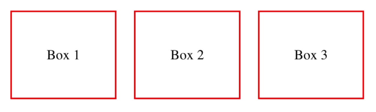
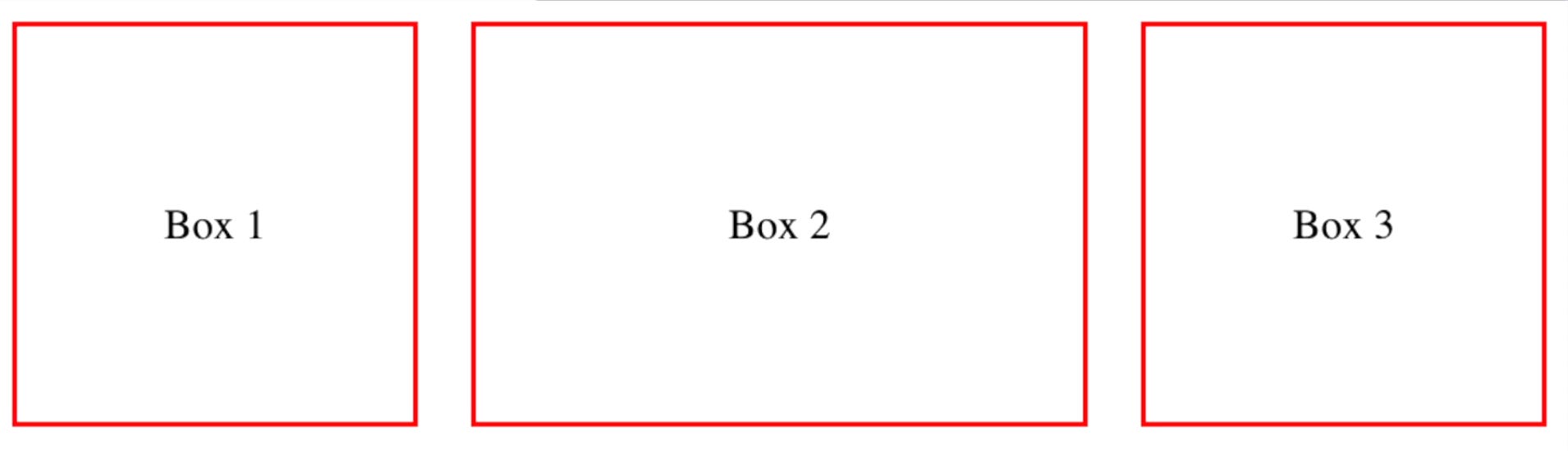
I have prepared a simple HTML page for you containing three different boxes:
<html>
<body>
    <div class="container">
        <div class="box">1</div>
        <div class="box">2</div>
        <div class="box">3</div>
    </div>
</body>
</html>
Making an Element Flex
To make an HTML element flex, give it the display: flex property.
.container {
    display: flex;
}
When you look at the result, you'll notice the three boxes appearing in the same row, because the default flex direction is row. You can change the flex direction using the flex-direction property:
.container {
    display: flex;
    flex-direction: column;
}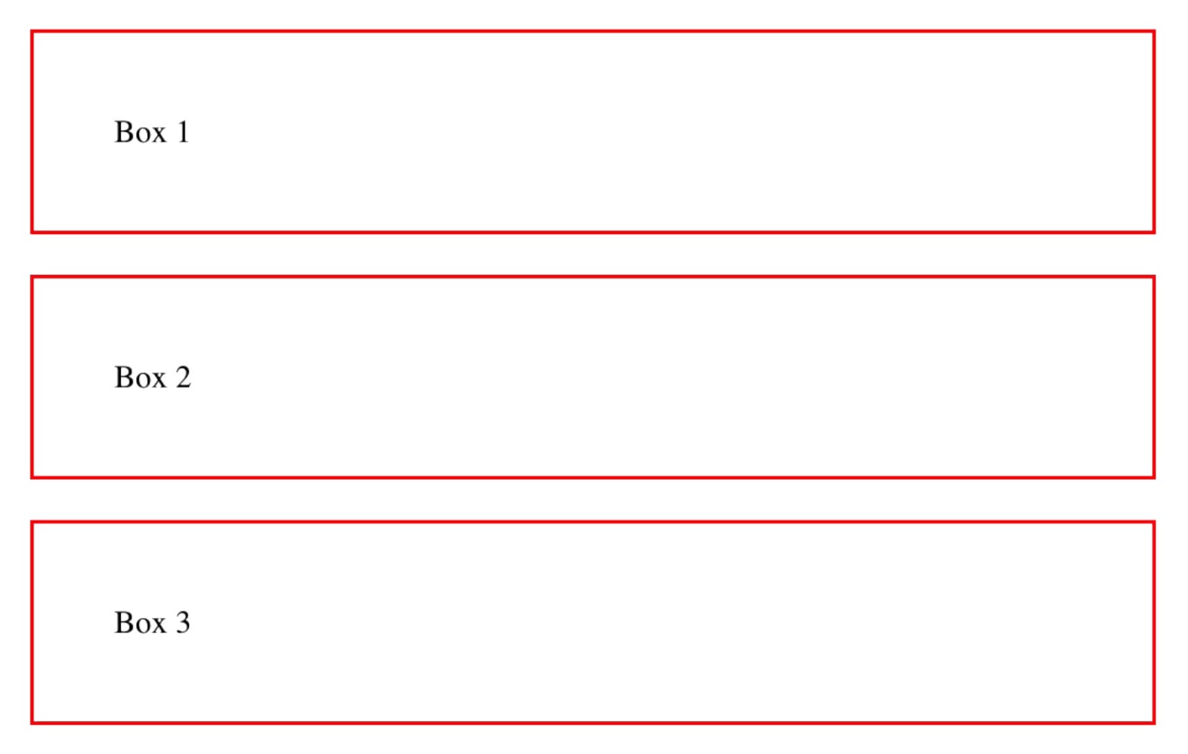
Growing and Shrinking Flex Items
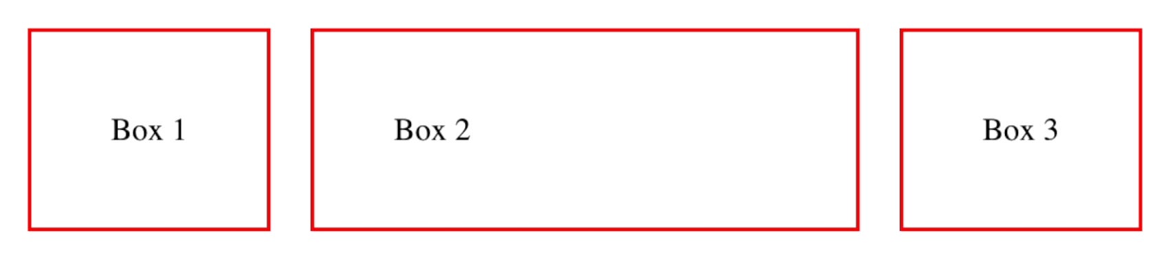
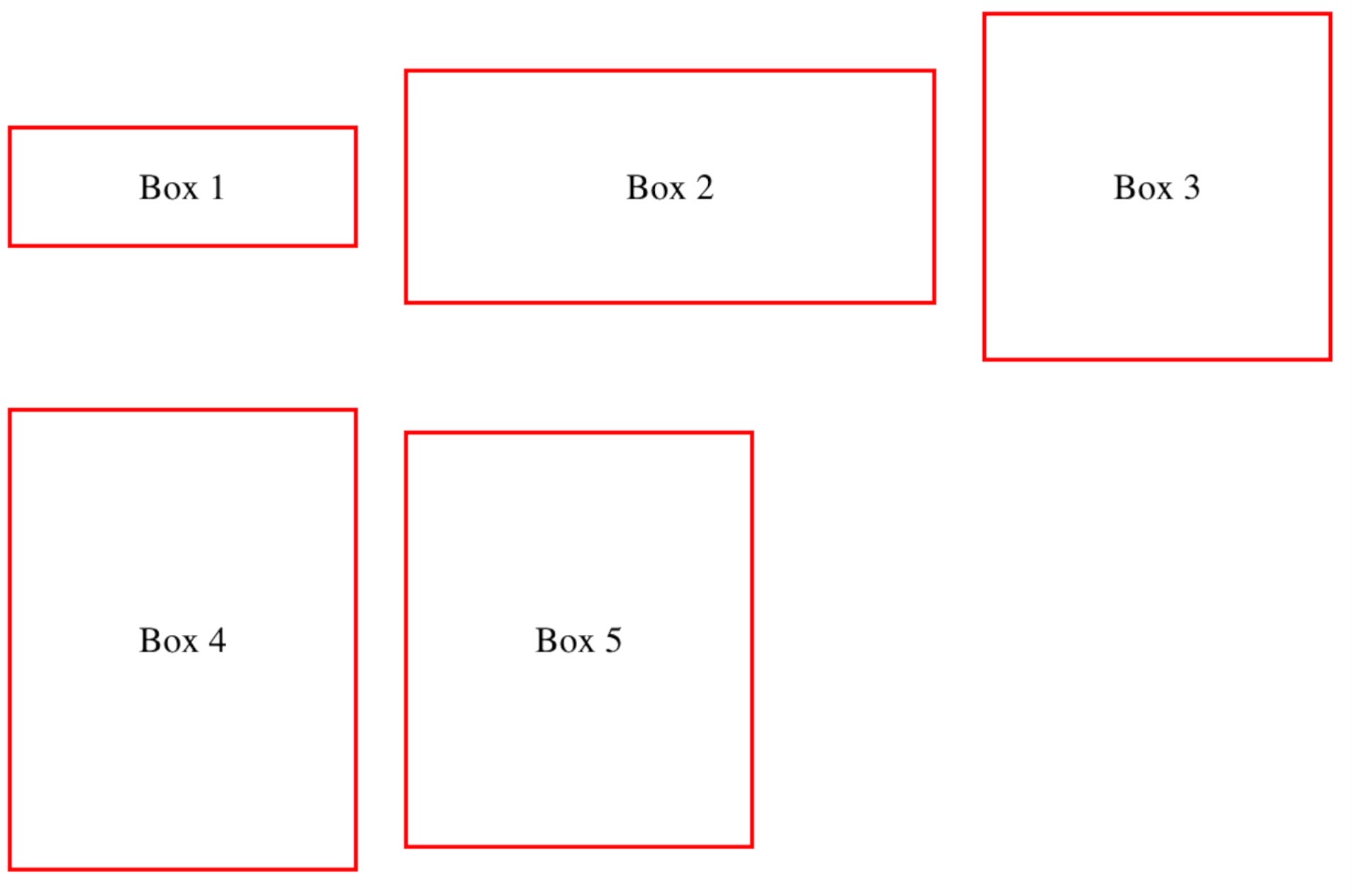
To make a box grow to fill additional space, use the flex-grow property:
.box2 {
    flex-grow: 1;
}
Setting the flex-grow property of the second box to 1 makes it grow to fill up the additional space of the row.
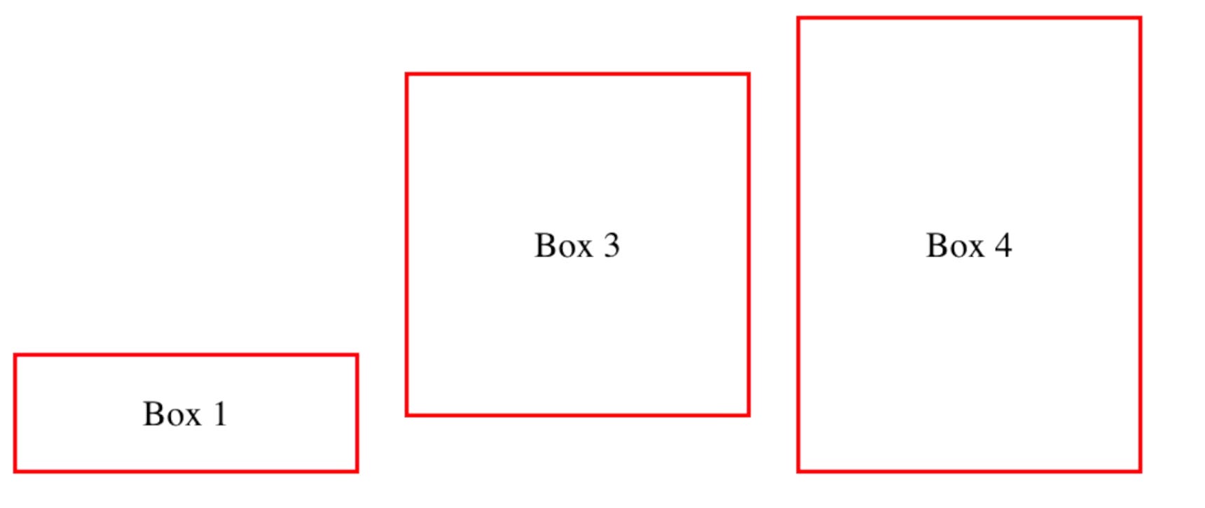
Flex Shrink
Similar to flex-grow, the flex-shrink property lets items shrink and give additional space to other flex items.
.box {
    flex-shrink: 1;
}
Flex Basis
The flex-basis property sets the initial size of a flex item before the additional space is distributed:
.box {
    flex-basis: 150px;
}
Adding Space Between Flex Items
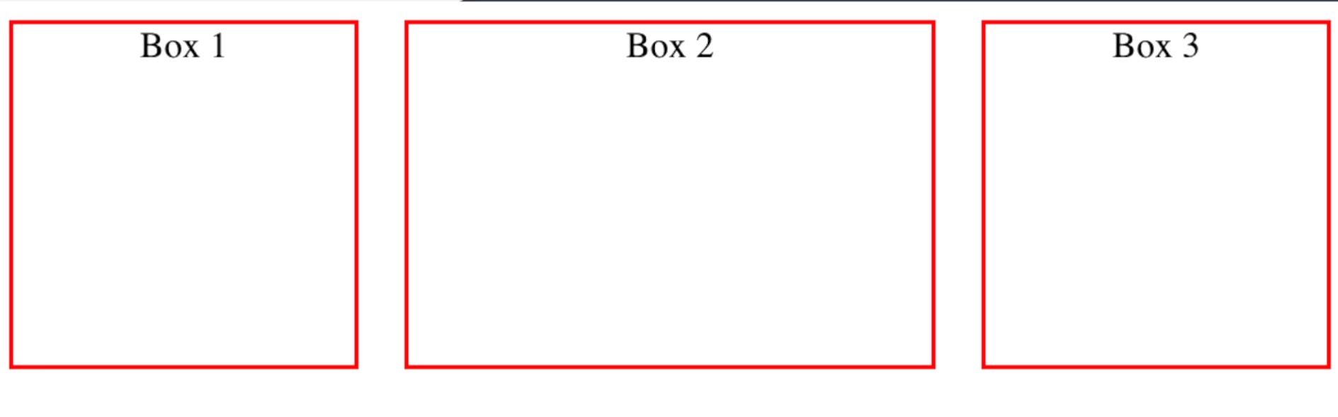
To add spacing between boxes, you can use the gap property:
.container {
    display: flex;
    gap: 20px;
}
Aligning Flex Items
Centering Content
To center content within a box, set the justify-content property to center:
.container {
    display: flex;
    justify-content: center;
}
Align Items
The align-items property is used to align items in the opposite flex direction:
.container {
    display: flex;
    align-items: center;
}
Other alignment options include align-items: baseline, align-items: flex-start, align-items: flex-end, and align-items: stretch.
Wrapping Flex Items
To wrap elements to the next row, use the flex-wrap property:
.container {
    display: flex;
    flex-wrap: wrap;
}
Aligning Items Individually
You can align flex items individually using the align-self property:
#box1 {
    align-self: center;
}
Controlling Order
Control the order of your boxes using the order property:
#box1 {
    order: 1;
}
#box3 {
    order: 2;
}
#box4 {
    order: 3;
}
Using the Flex Shorthand Property
Combine flex-grow, flex-shrink, and flex-basis in a single property using the shorthand flex:
.box {
    flex: 1 1 150px;
}

This is similar to:

.box {
    flex-grow: 1;
    flex-shrink: 1;
    flex-basis: 150px;
}